


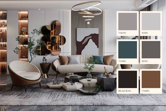
A homeowner furnishing a new apartment in Dubai may find that white walls, grey flooring and neutral furniture create a clean interior, yet leave the space feeling less distinctive than expected. Choosing a different palette involves more than selecting attractive colours, as daylight, architecture, materials and views all influence how an interior looks and feels.
Why Look Beyond White and Grey?
White and grey have become familiar choices in contemporary interiors because they offer flexibility across different architectural styles. They complement stone flooring, glass partitions, minimalist furniture and metallic finishes, while providing a neutral background for artwork and furnishings. For property investors, these colours can also provide a straightforward starting point for preparing a home for future occupants.
However, a neutral palette can feel flat when every surface has a similar tone or finish. In Dubai, where bright daylight enters many homes through large windows and glazed facades, subtle differences between materials can become less apparent at certain times of day. A predominantly white interior may appear stark, while cool grey surfaces can feel particularly cold when paired with blue-toned lighting or polished stone.
Introducing colour does not necessarily mean choosing bold walls or strongly contrasting furniture. Warm beige, soft olive, muted clay and deeper natural shades can add variation while maintaining a restrained appearance. The aim is to establish relationships between colours, materials and architectural features rather than treat each room as an independent decorating exercise.
For homeowners planning a new property or reconsidering an existing interior, working with a luxury interior designer can help establish a coherent palette that responds to the building, the available light and the practical requirements of everyday living.
How Dubai’s Light Changes the Appearance of Colour
Natural light is an important consideration when selecting interior finishes in Dubai. The intensity and direction of sunlight vary according to the room’s orientation, window size, surrounding buildings and time of day. A colour that appears soft and balanced in the morning may look considerably brighter under direct afternoon sunlight.
South-facing or west-facing rooms can receive strong sunlight, particularly during warmer months. Pale finishes may produce significant glare, while saturated colours can appear more intense than expected. In rooms with limited direct sunlight, the same shades may look quieter or darker. Large windows also introduce reflected colours from the surrounding environment, including the blue of the sky, the sea or nearby buildings.
These conditions affect more than painted walls. A cream stone floor may appear warmer beside oak joinery, while a cool grey floor can influence the appearance of nearby fabrics. Glossy finishes reflect light differently from matt surfaces, and polished stone can introduce highlights that change the visual balance of a room.
Artificial lighting adds another layer. Warm lighting can bring out the yellow or red undertones in beige and terracotta, whereas cooler lighting may make greens and greys appear sharper. Before committing to a palette, homeowners should assess paint, flooring and fabric samples under the lighting conditions in which they will be used.
Large samples are more reliable than small colour cards. Viewing them against existing flooring, cabinetry and window treatments throughout the day helps reveal undertones and contrasts that may otherwise be overlooked.
Choosing Colours for Different Rooms and Property Types
A successful palette reflects the character of the property as well as the intended use of each room. Warm neutrals, earthy shades, muted greens and deep blues can all work in Dubai homes, but their application should respond to the available space and architectural context.
Warm beige, sand and soft taupe offer alternatives to white without introducing strong contrast. These shades work particularly well with limestone, travertine, timber and textured upholstery. In living areas, they can establish a calm foundation for furniture and artwork. Bedrooms may benefit from slightly deeper or softer variations, creating a more enclosed atmosphere than the brighter finishes often used in shared spaces.
Muted greens and earthy browns can introduce a connection with the landscape, particularly when paired with natural wood and textured stone. Terracotta and clay shades can add warmth to dining areas, feature walls or selected pieces of furniture. Deep blue may suit a study, media room or bedroom, especially where the architecture provides enough natural light or layered artificial lighting to maintain visual balance.
The property’s setting also matters. A waterfront apartment with expansive glazing may benefit from colours that complement the sea and sky without competing with the view. Soft stone shades, muted blue-green accents and understated timber finishes can support this relationship. Strong colours are not necessarily unsuitable, but placing them on large surfaces may draw attention away from the landscape outside.
A contemporary villa may offer greater opportunities to use colour across several connected spaces. Larger rooms, generous ceiling heights and clearly defined architectural features can accommodate deeper tones on selected walls, cabinetry or furniture. In contrast, a traditional residence with decorative mouldings, patterned flooring or established architectural details may benefit from a more restrained palette that respects its existing character.
Floor area and ceiling height influence how colour is perceived, but no simple rule determines which shades belong in small or large rooms. A darker colour can give a compact room depth, while a pale colour can help a larger room feel more open. The outcome depends on contrast, lighting, surface texture and the arrangement of furnishings.
Balancing Colour Across Materials and Finishes
Colour should be considered alongside the materials that occupy the largest areas of a home. Flooring, wall finishes, kitchen cabinetry and built-in wardrobes form the visual foundation of an interior. Furniture, curtains, cushions and decorative objects then introduce additional tones and textures.
One practical approach is to select a main neutral, a supporting colour and a limited number of accent shades. The main neutral might appear across walls and larger upholstered pieces, while the supporting colour is introduced through joinery, rugs or selected furniture. Accent colours can be reserved for artwork, cushions, lighting or smaller decorative elements.
This approach does not require every room to use identical colours. Instead, recurring undertones and materials create continuity between spaces. For example, a warm stone finish might run through the living and dining areas, while a muted green appears in the study and a deeper version of the same colour is used in the bedroom. The rooms retain individual character without feeling disconnected.
Material texture is equally important. The same beige can appear understated on a matt painted wall, richer in velvet upholstery and more varied in natural stone. Timber grain, brushed metal, woven fabrics and textured plaster introduce visual interest without requiring additional colours. This is particularly useful in interiors where the architectural design favours clean lines and limited ornamentation.
Sun exposure should also inform material selection. Fabrics placed beside large windows may fade over time, so window treatments and upholstery should be chosen with their location and expected exposure in mind. Suitable UV-filtering window treatments can help reduce fading, while durable, colourfast fabrics and finishes specified for their intended use can improve long-term performance. Natural materials should be assessed individually, as their resistance to sunlight, heat and daily wear varies.
Common mistakes include selecting paint from a small sample, overlooking undertones and combining several strong shades without a clear visual hierarchy. Copying a palette from a photograph can also produce disappointing results because the image may use different lighting, camera settings and materials from those in the actual property.
A Colour Strategy That Works Over Time
A considered colour palette should accommodate both the architecture and the way a home is used. Kitchens and living areas may need finishes that withstand regular cleaning, while bedrooms can accommodate softer textures and more personal colour choices. Circulation spaces can link these rooms through repeated materials, related undertones or consistent joinery finishes.
Before finalising the scheme, assess how colours interact across adjoining rooms and under both natural and artificial light. Test larger samples in their intended locations, examine them at different times of day and compare them with permanent finishes such as flooring and stone. This simple process can reveal whether a palette feels balanced before substantial purchasing or installation decisions are made.
Moving beyond white and grey does not require abandoning neutral interiors. It means choosing neutrals with greater intention and introducing other shades where they support the architecture, materials and atmosphere of the home. The most effective palette is not necessarily the most colourful, but the one that responds to the specific property and remains coherent as light, furnishings and daily activities change.